SeeSignal Mobile

BadVR • 2020

The most convenient way to find Wi-Fi dead zones.

The Challenge: 
Distilling the fundamentals from an existing AR solution and bringing them faithfully into a mobile solution. How might we create a mobile implementation that retains the strengths that made the original so powerful?

My Role
Lead UI/UX Designer
Timeline4-Week Sprint
Team
2x Marketers
1x Devs
ToolsAdobe XD
Adobe Illustrator
ContributionsResearch & Analysis
Concept Ideation
Rapid Prototyping
Interaction Design
Visual Design
The ClientBadVR’s mission is to giving non-technical people the ability to see critical insights from their data by leveraging the power of XR.

To fulfill this mission, they created SeeSignal, an AR solution that unlocks your wireless signal “x-ray vision”.
Project Goals
What does success look like?First, we aimed to build a simple, no-brainer AR application with intuitive controls. Next, we wanted to explore how smartphone AR could be leveraged over headset AR to maximize its potential. Lastly, we focused on enhancing usability by incorporating mobile-specific UX paradigms to create a seamless experience.
Discovery
What key aspects need a design overhaul?My first step was to focus on retaining the main value propositions and features of the original solution. After using SeeSignal on Magic Leap myself, I distilled that gadget functionality, signal stick interactivity, and an emphasis on 3D were the main distinctions to carry over into the mobile solution.
Gadget Functionality
The original SeeSignal gives users access to "gadgets": 3D tools locked to a controller that assist in signal analysis. SeeSignal Mobile should retain these gadgets and translate them faithfully to a mobile variant with the utilization of a carousel.
Signal Stick InteractionOne of the key features of SeeSignal is being able to reach out and touch the sticks to glean more information from each reading. SeeSignal mobile must be able to have intuitive interaction with the sticks around the user.
Emphasis on 3DAfter talking with the CTO, the app should retain its 3D roots from its older Magic Leap sibling. SeeSignal Mobile should have a focus on utilizing elements of the mobile AR paradigm that enhance the finding, discovery, and diagnosing of signals around the user.
Task analysis
How will it work?After finalizing our plans, I constructed this user task flow with the approval of the Product Manager and CTO.
Design and prototyping
What does it look like?From acquired research and developed analysis, I helped develop design ideas that would effectively solve the problems at hand. I started with some rough sketches depicting what the viewfinder should see and then what each gadget should look like.

Next, I used Illustrator to mockup most of my initial sketches and then I stitched them together using Adobe XD.
User testing and feedbackSo do these designs work?I shared these initial mockups with my team, conducting usability tests with digital prototypes. Two key critiques emerged:
Change #1
Be more mindful of available screen “real estate”
Unlike headset AR, where you have much more space to work with, smartphone AR constrains the user to the size of their own device. I shrank the size of my components and open up the space more for elements on the screen.
Change #2
UI is too 2D in nature
This implementation has lost much of the 3D nature that BadVR specializes in. I applied more 3D design into this 2D space to encourage exploration and interaction with signals.
Building the final prototypeHow did I update it?After successfully implementing changes from user testing, I made a final pass on UI, focusing as much as possible on elevating readability and utilizing dimensionality.
Main ScreenUpdated Viewfinder
All interactive elements have been pushed as far to the top and bottom of the screen as possible. Tapping a signal stick reveals a popup showing the strength and other statistics.
GadgetsFinder, Meter, and Styler
Extra dimensionality really helped to bring these gadgets to life. The finder juts into 3D space pointing to the strongest signal stick. The meter exists in space, explaining signal data at your current location. Even the styler zooms closer to the user as they swipe through the color carousel.
SettingsAdded Options
Here is the basic settings menu. It allows for quick access to signal type access and network settings.
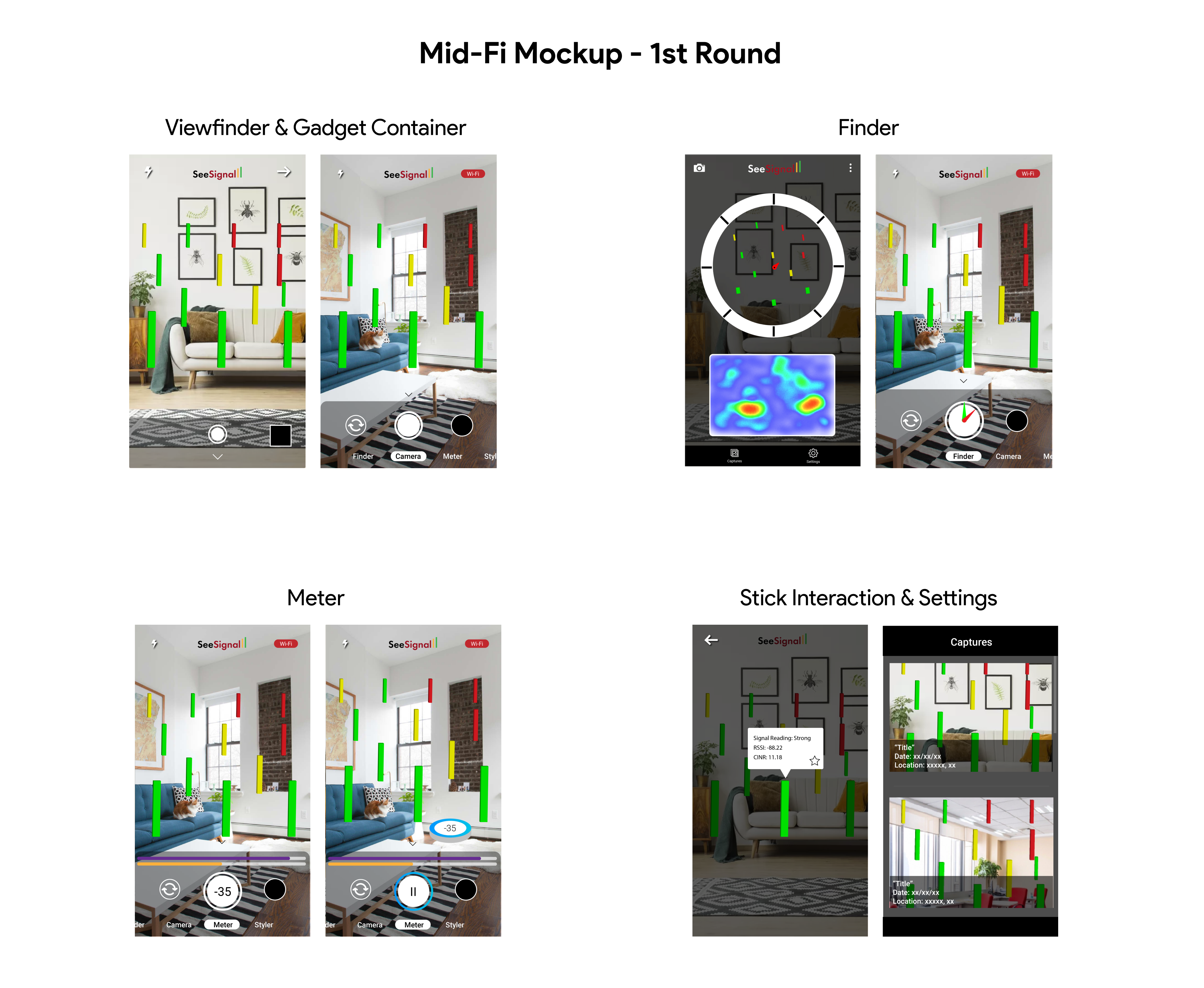
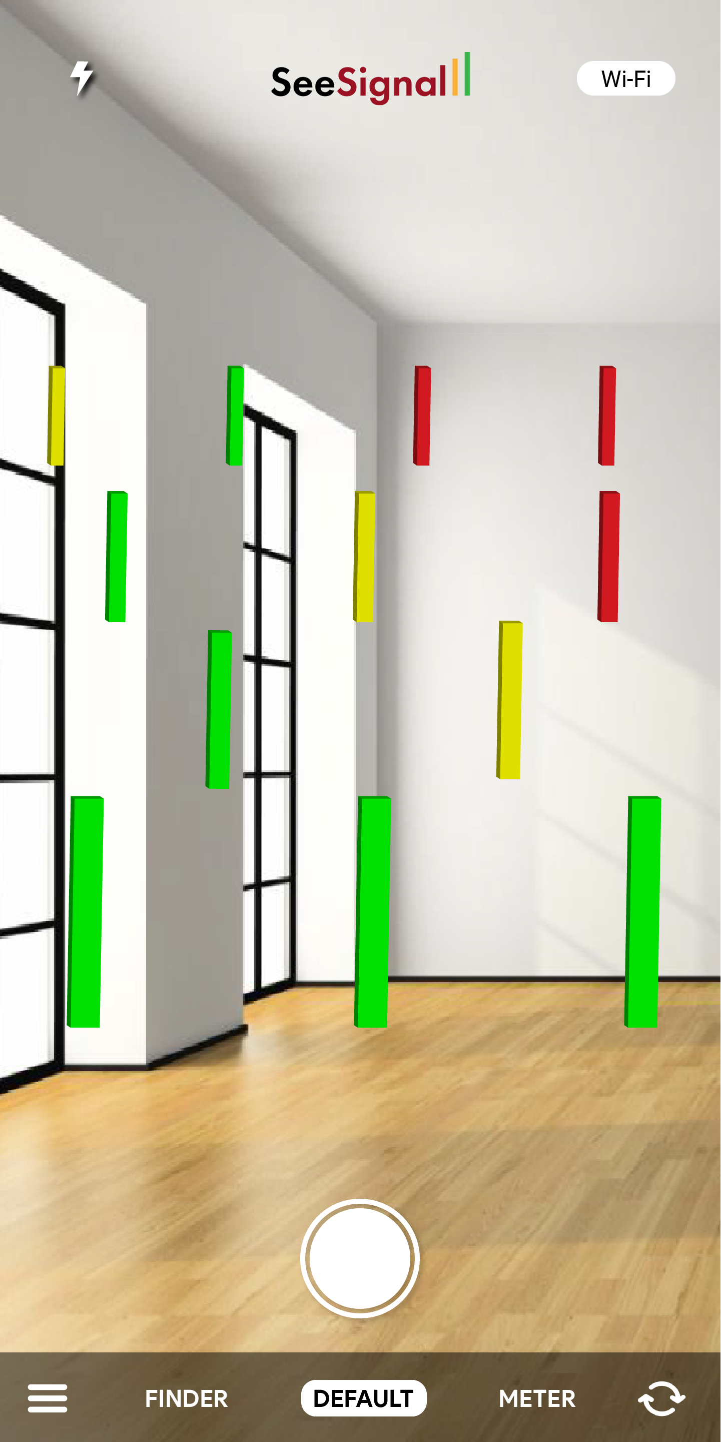
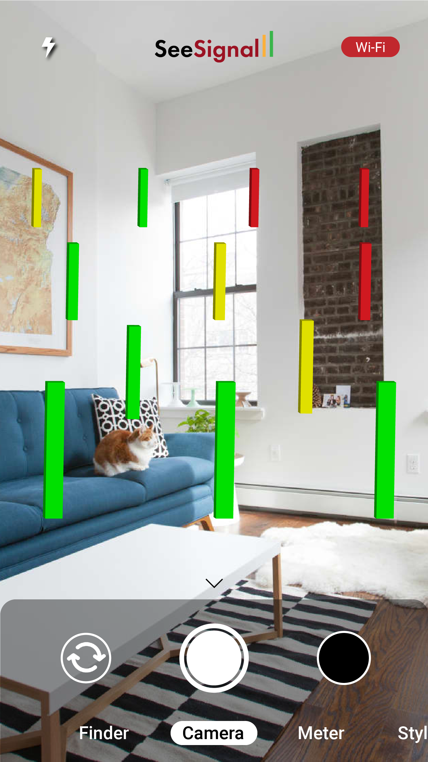
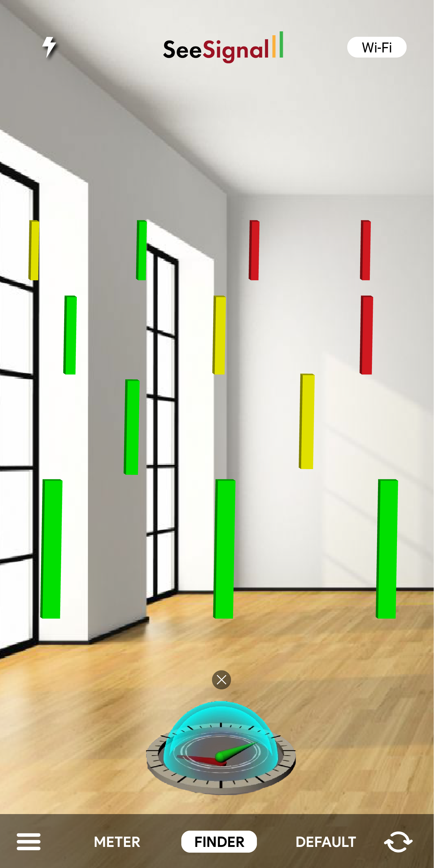
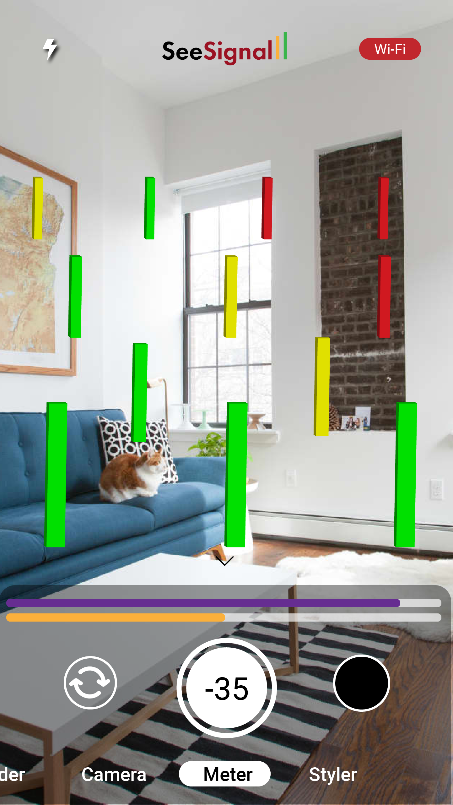
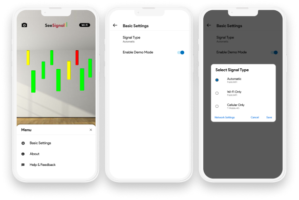
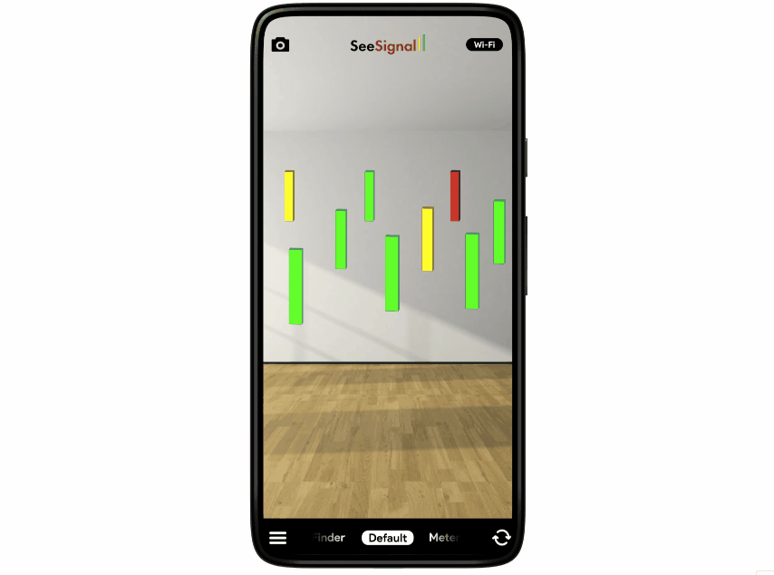
A successful redesignWhat did the final product look like?
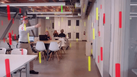
Overall, the team was very pleased with the turnout of the app. We only had a few weeks to develop it, but we were able to get all features and designs finalized in a very efficient manner. The functional prototype (in the form of an Android app) was built and was demoed at CES 2020 to mass appeal.

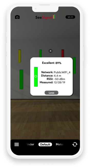
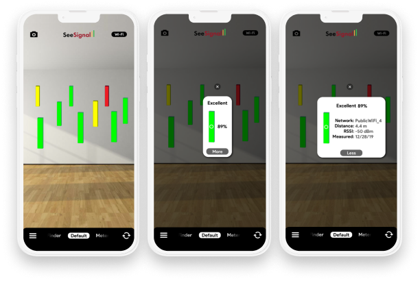
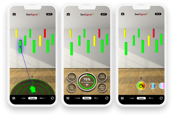
After evaluations on the outcome of the app, some small updates could be made in order to improve the experience. The "flip camera" feature ended up not getting implemented, so further designs should omit the feature. Also, the popup feature requires more fleshing out. I propose a design with less text and more visual representations.

The final prototype is linked below for your viewing pleasure. Let's connect so I can get your feedback as well!

See the Prototype ➡