Virtual Operations Center

BadVR  •  2020

Triage and plan scenarios with cutting-edge, award-winning solution

The Challenge: 
Create AR interfaces for both first responders (heads-up displays/HUD) and incident command (holograms/HOLO), utilizing building and network sensor data. How might we design a system where commanders can relay orders and display objectives to first responders in the field in real-time?

My Role
UI/UX Designer
ToolsFigma
Adobe Photoshop
Adobe llustrator
Gravity Sketch
Team
1x Project Manager
1x Product Manager
3x Engineers
Timeline4-Week Sprint
ContributionsProblem Framing
User Interviews
Competitive Analysis
Concept Ideation
Rapid Prototyping
Interaction Design
Prototype Testing
NISTWith an ever-growing need for improved user interfaces designed around the first responder crises, NIST hosted the CHARiOT Challenge Competition to explore various AR solutions.

Our solution was Virtual Operation Center, an "ops center in a box" that grants first responders better situational awareness during critical missions in real-time.
Project goalsWhat are we looking to solve?To tackle the challenge, we set three key goals. First, we aimed to create a functional and comfortable persistent HUD that users could rely on. Second, we wanted to explore how holograms might assist incident commanders in their decision-making. And third, we focused on designing a menu system that seamlessly lets users switch between HUD and HOLO modes.
Problem FramingWhat constraints do we have?My first step was to distill the many working parts of this solution and see where AR could possibly help in each situation.
Active Shooter
Flood
Mass Transit Accident
Wildfire
After attending the competition's many seminars, our team concluded we had to create 2 different UI experiences for each of 4 above scenarios: Active Shooter, Flood, Mass Transit Accident, and Wildfire. That means we had to do 8 unique user interfaces: 4 first person "HUD" interfaces and 4 incident command "HOLO" interfaces.
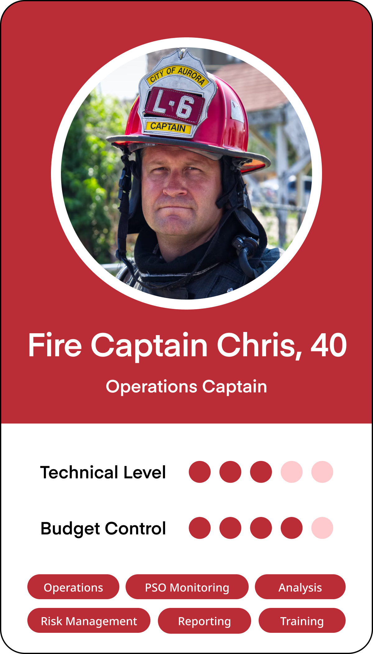
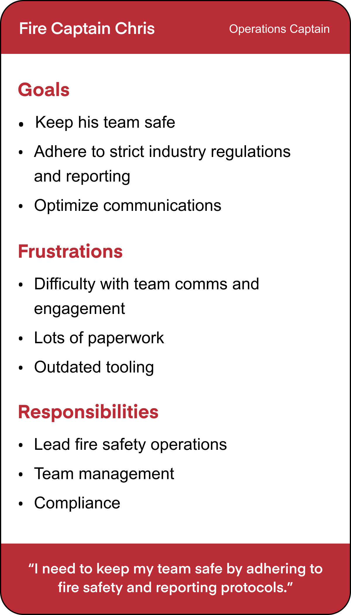
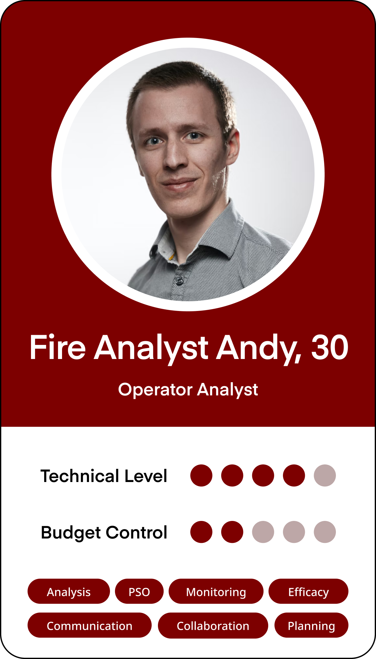
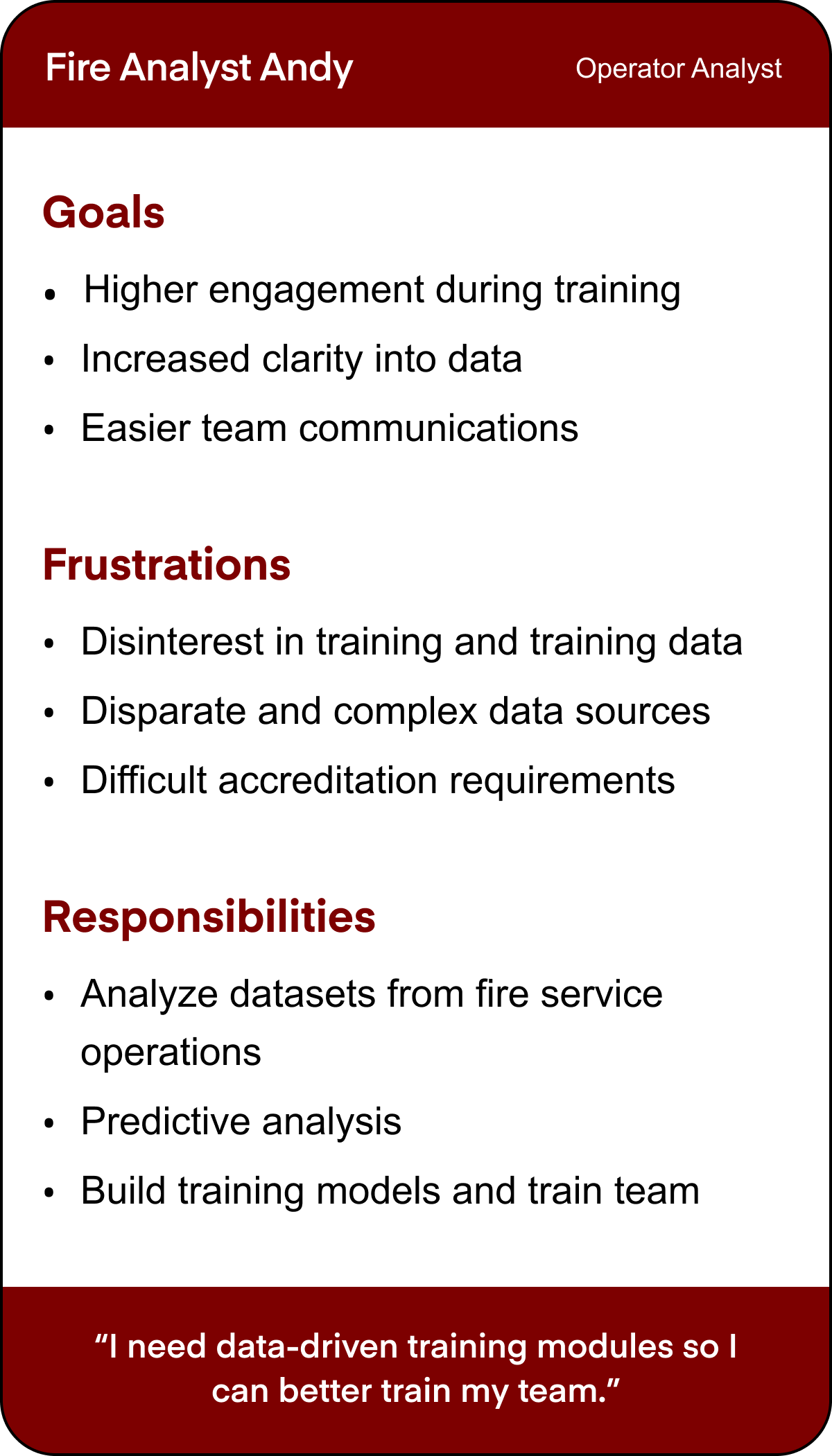
User Research and Competitive AnalysisWho are our users, and what are their pain points?In order to understand first responders, we had to get more information about them. First, we were able to run a competitive analysis on current systems via NIST's seminars, which can be seen below:
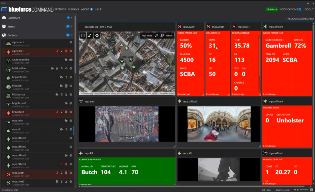
The current solution uses a flat, dashboard-style layout with widgets for body monitors, camera feeds, and GPS. Through interviews with fire chiefs and firefighters, we gathered insights on their roles, goals, and challenges. Combining these findings with our competitive analysis, we identified key takeaways:
Pain Point #1
Current systems are crowded and limiting
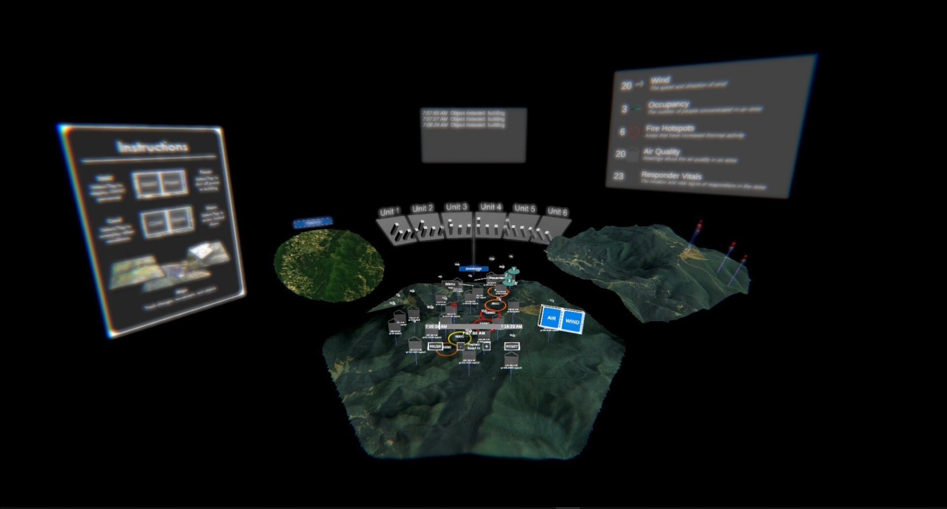
These dashboard have an overwhelming amount of information. Not being able to follow multiple personnel simultaneously was also a limitation we found.

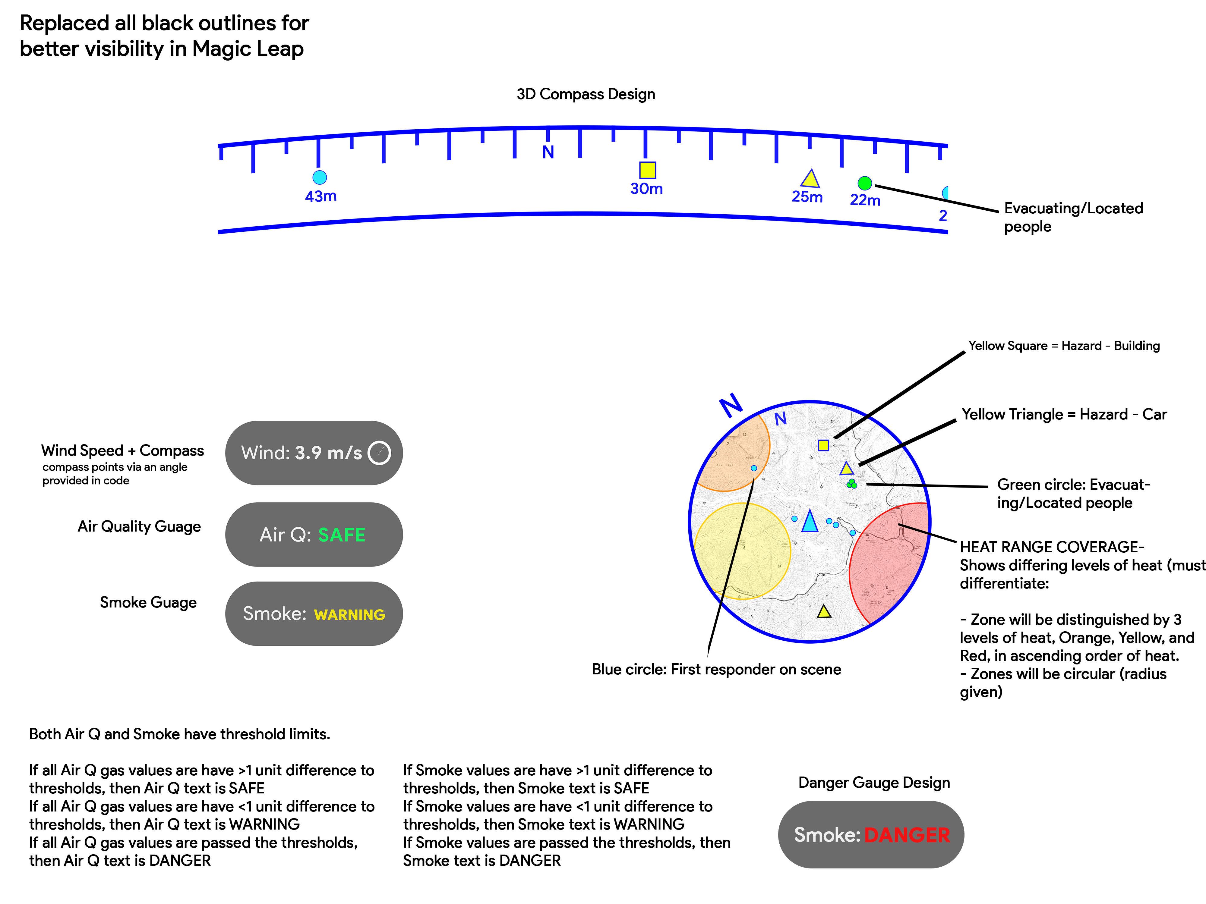
Finding: Our solution needs to be able to show multiple datasets at the same time.
Pain Point #2
Lack of correlation between datasets
Datasets are displayed arbitrarily. There is no direct correlation that linked these sets together.

Finding: Our process needs to include ways to display all relevant information about personnel in question.
Pain Point #3
Responders struggle with location datasets
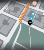
First responders in the field would greatly benefit from knowing where they are in relation to points of interest (victims, hazards, people of interest).

Finding: HUD system should include ways to ingest GPS data and display in usable way.
PersonasWho exactly is our target demographic?From our user research, we were able to distill some personas that we would be building for. We found that captains for most first responders shared characteristics with Fire Captain Chris and most incident command shared qualities with Fire Analyst Andy (sans fire specific knowledge).
Task analysisHow will this work?After finalizing our plans, I constructed this user task flow with the approval of our team lead:
Design InspirationWhat existing comps can we reference?After determining how our menu process would work, we decided to pull inspiration from the video game industry. For HUD systems, we analyzed first person shooters, while for HOLO systems, we analyzed RTS games.
Inspiration #1Live Minimap
Minimaps help players pinpoint their location and see their surroundings from a top-down view. They also highlight points of interest for easier navigation. Adding this to our HUD UI would address our first responder's directional challenges.
Inspiration #2Interactive Expanded Map
RTS games use large, interactive maps to display key data like locations, points of interest, and zones. This approach would be ideal for our incident command users (HOLO), allowing them to track POIs and live first responder locations in real time.
Inspiration #3Waypoint Compass
Many FPS games feature a waypoint compass in the HUD, displaying key points, distances, and a compass rose. Adding this to our HUD would help users orient themselves faster than relying on radio or other methods.
Design and prototypingWhat should this look like?After understanding our users and initial brainstorms, I converted these ideas into sketches for both HUD and HOLO systems.
Start Menu UI
Initial Menu Sketches
My first pass on the start menu UI looked something like these. I wanted a way to select either a HUD or HOLO experience for each of the 4 scenarios presented.
Menu Mid-Fi Mockups
I constructed these menus using Figma. I first started with a layout that would have instructions centered in the experience so users could understand how to use the controller. I later would relocate this to the bottom of the selection screen with the assumption that our judges would know how to use the controllers already, and would be more concerned with switching between scenarios rather than focus on instructions.
First Responder UI (HUD)
Initial HUD Sketches + Flow
My first pass on the HUD involves a waypoint compass above the user's view, a minimap in the bottom right corner, point of interest information, and notifications on the upper left hand side. I intentionally kept the UI on the edges of the user's vision so that their field of view would not be obstructed by UI.
HUD Mid-Fi Mockups
Bringing these designs into Figma allowed me to understand just how large this UI had to be when placed in front of the user. With such a small amount of room for use (since this was to be used with Magic Leap One headsets), I had to make sure I could get all the UI in the scene while still allowing users to have ample room in the center to see in front of them. I also explain a particular flow for each of these examples of how these would be used by a first responder.
Incident Command UI (HOLO)
Initial HOLO Sketches + Flow
My first pass on the HOLO involves a large 3D map in front of the user, populated with buildings, important points, and geospatial landmarks. The map would be surrounded by accompanying data like video feeds and organized data structures. I demonstrated here how interacting with a data point pulls up relevant information about that point in a stick popup. After my initial HOLO sketches were presented, the mid- to hi-fi stages were created in Unity by another engineer, shown below.
User testing and feedbackWhat do our users say needs improvement?I ran these mockups by the rest of my team, testing each of my team members with digital prototypes. There were two main critiques:
Change #1
Be more mindful of available screen “real estate” in HUD
Since the HUD would be attached to a user's view at all times, it was imperative to leave as much space "empty" as possible. I remedied this by moving the compass just above the eyeline of the user, and making the minimap, notification components translucent for better environmental visibility.
Change #2
Implement more 3D characteristics in HOLO and Menu
Feedback from the team insisted I try to inject some more life into our scenes. Adding color and 3D graphics really helped the look and feel of the experience and further demonstrated the strengths of having an immersive UI. By adding more logical 3D assets, the benefits of immersion became more feasible to our judges.
Building the final prototypeWhat did we finally present?After successfully implementing changes from user testing, I made a final pass on UI, focusing as much as possible on expanding on space and utilizing dimensionality.
Start MenuA dimensional startBy keeping all UI in a vertical format, users would be able to interact with these elements more easily considering the small field of view of the Magic Leap One. From here, users can jump into any of the various scenarios by tapping on HOLO or HUD under each 3D diorama.
HOLOMaking incident command easierTapping on HOLO brings a user into the incident command experience. Here, users can interact directly with points on the map - seeing multiple data points per POI all in one panel.
HUDTriage is better with XRWith this HUD, users will be able to receive live updates in the field. First responders will be able to locate civilians, hazards, and other responders without having to lift a finger.
A successful redesignWhat could we have done better?This project was a major success. Despite a tight timeline, we outperformed the competition, advancing through each round and ultimately winning the entire event.

Reflecting on the process, we identified a few refinements that could further enhance the experience. If we had received insights about HOLO and HUD interactions earlier—rather than midway through the competition—I would have prioritized optimizing UX flows to better integrate the two. Additionally, dedicating more time to a comprehensive UI kit and clearer design guidelines would have helped create a more cohesive experience.

This project later evolved into our current Virtual Ops Center product, now deployed across multiple customers. We continue to refine its usability and design to enhance the overall experience.

Below are additional screenshots of the final prototype. Feel free to reach out with any questions or thoughts on the design process!